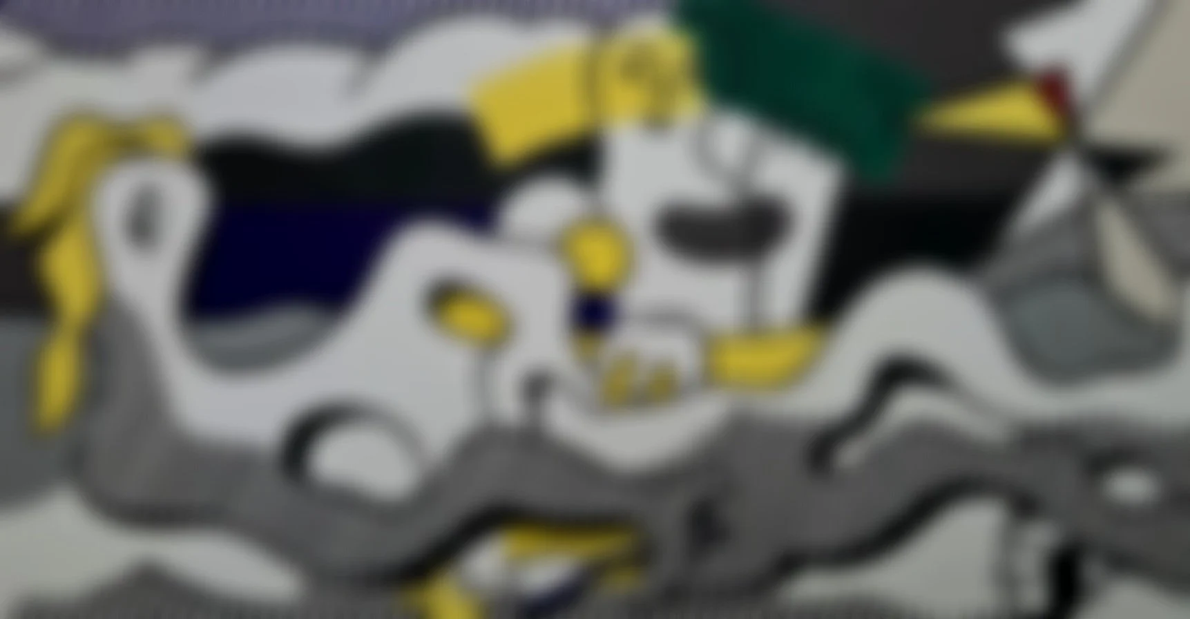
At The Beach
Except for their flagrant humor, of course, Lichtenstein’s Pop art and even his 1977-1979 works on surrealist themes are antithetical to fundamental principles of surrealism. Whereas classical Surrealist art strives for spontaneity with the use of automatist and chance techniques, Lichtenstein’s images are strictly premeditated and meticulously rendered. Moreover the inevitably upbeat mood of Lichtenstein’s images is far removed from the foreboding mood essential to even the sunniest Surrealist works. Even so, Lichtenstein’s Pop art works appealed to collectors with a special fascination for Surrealism.
Arguably the most complex pictures Lichtenstein had attempted up until 1977, his surrealist theme works should be understood as an ambitious response to the Whitney Museum of American Art’s survey exhibition Art About Art, organized to investigate the widespread parody and appropriation of history of art icons by contemporary artists since the 1950s. Lichtenstein was the most extensively featured artist in this exhibition, with more than twenty works, including the Picasso-esque Girl with Beach Ball II, 1977 [source excluded]. [1]
From 1977-1979, Lichtenstein would revisit his surrealist roots with a series of paintings and prints. During this extremely prolific period, he created about 49 surrealist paintings and two print series. Seven prints dubbed the “Surrealist Series” were created in 1978 at Gemini G.E.L. Thirteen prints dubbed the “American Indian Theme Series” were begun in 1979 at Tyler Graphics. All were very or fairly small editions (from generally 32 to 50 plus proofs).
About the Gemini G.E.L. series of works (Surrealist Series), it is said that:
[The Gemini G.E.L. prints] presented him with entirely new challenges and significantly altered his way of working. Since the 1960s Lichtenstein had generally utilized photographic and mechanical processes to obtain the clean, impersonal, mass-produced look he sought. But for the Surrealist series, he drew directly on the plates and stones with Spectracolor pencil, sometimes using a combination of Spectracolor pencil and tusche to create the larger areas of color. For this project, Spectracolor pencil proved to be a better drawing medium than the regular lithographic pencil, because its sharpened point was less likely to break against the hard surface of the plate.
One of each print in this series was designated to support Change, Inc., the organization founded by Robert Rauschenberg in 1970 to provide emergency funds to artists in need. [2]
Year: 1978
Medium: Lithograph on Arches 88 Paper
Hand-signed (rf Lichtenstein), dated ('78) and numbered in pencil bottom right
From an edition of 38; plus 7 AP, 1 RTP, 1 PPII, 1 SP, 1 WP, 3 GEL, 1 C, 1 Change, Inc.; this is AP 7/7
Image size: 17 11/16 x 33 15/16 in. (44.9 x 86.2 cm)
Sheet size: 26 x 42 in. (66 x 106.7 cm)
Frame size: 28.5 x 44.75 in (72.39 x 113.67 cm)
Provenance:
Gemini G.E.L. (the printer)
Distinguished Private California Collection (upon release)
Long-Sharp Gallery
* This work has been acquired
[1] Stuckey, Charles. 2005. Roy Lichtenstein: Conversations with Surrealism. New York: Mitchell-Innes & Nash.
[2] Corlett, Mary Lee. The Prints of Roy Lichtenstein: A Catalogue Raisonné, 1948–1997, 2nd ed. New York: Hudson Hills Press in association with National Gallery of Art, Washington, D.C., 2002.